Hey… The site has been re-designed.
The old design has been in use since like 2008 and I was really sick of it and thought it was bad.
This design should be easier to navigate and find news for specific wrestlers and promotions. For example, now “The Big Dog” Roman Reigns and Impact have their own pages if you only want to read Roman Reigns and Impact news. This design will also work better on mobile phones and you’ll now see the full version of the site.
This will hopefully allow TPWW to grow more since a lot of new visitors were definitely getting turned off by the old design.
I hope you think it’s an improvement and if not for some reason, I hope you can get used to it and stuff. I know that new designs are pretty jarring at first and often don’t go over well.
That’s it, I think. Thanks for reading this post and this site.
Here’s a history of the various shitty designs TPWW has had for anyone interested:
1998-1999

1999-2003

2003-2008
The worst one by far imo…

2008-2018

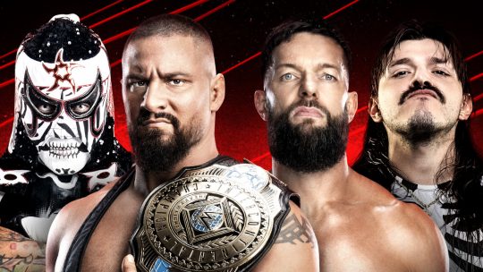 WWE: Penta & Bron Breakker vs. Judgement Day and New Day Tag Team Matches Set for 3/31 WWE RAW Show, Update on WWE’s Talent Tryouts This Weekend in U.K., More News
 [Spoiler] WWE NXT Talent Makes Surprise Appearance at 3/28 TNA Impact! Tapings, Main Event Match Set for TNA Rebellion 2025
 AEW Collision Show to Air on April 17th During WrestleMania 41 Week
