WWEGames Twitter account put up a video today showing off some of the improvements they’ve made in the new game and I have to say, what they’ve showed here is a noticeable improvement. The lighting model, the skin shader and better faces for Seth Rollins, Brock Lesnar and Randy Orton really do look good here. The Universal title looks a little thin, but the new texture on it stops it from looking like a toy like it has in previous versions of the game.
For me, this is all great. They just have to show 3 things to really make this a big improvement:
Snark free, this is looking the most promising since 2k15 when they changed generation, but it failed to live up to the hype. Could 2k18 do it? I’m not holding my breath, but I remain optimistic for once. Check the full Tweet and video below.
Today's #WWE2K18 @WWE2Kdev Spotlight series episode shows a side-by-side comparison of @RandyOrton's 2K18 and 2K17 entrance and much more! pic.twitter.com/wBIBk2D8CK
— WWE 2K18 (@WWEgames) August 11, 2017
 WWE: WWE EVP Chris Legentil on Plans for More International PLEs in 2025, WWE Reportedly Planning to Debut New Tribal Chief Championship, More News
 AEW Collision Ratings – Dec. 14, 2024 – Viewership Down, Key Demo Up
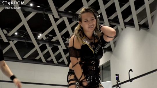 Momo Watanabe Advances to International Women’s Cup Match at NJPW x AEW Wrestle Dynasty